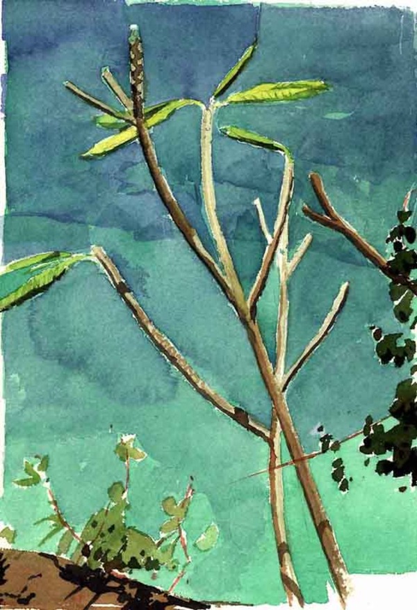
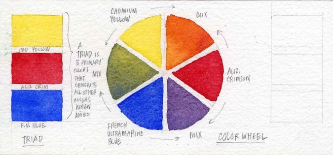
MIXING COLORS
The best way to introduce the idea of mixing colors is to have you mix the ugliest color: gray. (We're going to mix abut 50 shades of it, so make sure you're in a safe place.) Why gray? Because gray is what you get when you mix opposites on the color wheel. Mixing gray will help both your understanding of the color wheel and your understanding of another concept: color temperature. What is color temperature? It's the degree of warmth or coolness found in a color, usually having to do with the amount of red or blue found in the color. But we get ahead of ourselves. Let's try mixing some grays.
In the examples below, I have you use four different pairs of colors generally thought of as "opposites across the color wheel" to create grays. For those of you who like lists (and who doesn't?), those color pairs are:
Burnt siena and Cobalt blue (known as a "sedimentious" pair for reasons I'll discuss elsewhere)
Yellow Ochre and Windsor violet
Cadmium red and Prussian blue (a dye-based or "stain" based pair, because of the extraordinary staining power of Prussian blue)
Burnt Umber and French ultramarine blue
Each of these pairs, when mixed with more or less of the warm color with respect to the cool color, is capable of producing a warmer or cooler gray. Each of these pairs also produces a subtly different gray which, with practice, you will come to know exactly when you want to use. To get started, create an arrangement that features each color in its own small area, then a larger area of the mixed gray between them, with the warm color more dominant on one side, and the cool color more dominant on the other. I chose the silly configuration below, but feel free to use any kind of shape you please. I'll be sure to note your design when I see it posted to your Pinterest page.